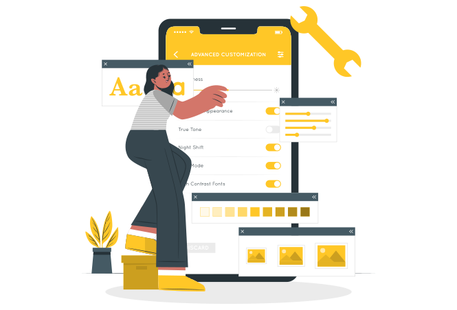
Mobile Website Designing
Sikaria Tech is a Mobile website design, mobile websites are prioritized by search engines and are displayed at the top of search engine result pages. Additionally, Google's Accelerated Mobile Pages (AMP) resulted in a tenfold increase in traffic and a twofold increase in user hours. Consequently, it is unsurprising to observe businesses capitalize on the increasing popularity of mobile phones and employ mobile web design services to ensure that their websites load quickly on mobile devices and are effectively sized to suit within the mobile screen frame. Our mobile web design services assist you in the development of a mobile website that is not only representative of your business but also user-friendly, intuitive, and fast-loading, with a focus on mobile users.